Turning a complex rate-card workflow into a clearer path forward.
Managing and validating rate cards involved a lot of information, multiple decision points, and different user needs. This work focused on understanding the real workflow behind the screens, then redesigning the experience so users could identify problems faster, understand what needed attention, and move through the process with more confidence.

INDUSTRY
Enterprise SaaS + workforce data
My role
UX leadership, research, journey mapping, workflow design
RESEARCH APPROACH
Make a complex rate-card validation process easier to understand and act on
DELIVERED
A clearer workflow for reviewing issues, making decisions, and moving forward
The workflow had grown more complicated than the experience could support.
Rate-card management was not a simple upload-and-submit task. Users needed to bring in data, understand whether it was valid, identify problems, review what those problems meant, and decide what to do next. Different roles entered the workflow with different responsibilities and levels of context. The product needed to support that complexity without making users carry the entire process in their heads.
What made this challenging
The process had multiple paths and exceptions
Different situations required different decisions, which made a single linear flow unrealistic.
Users needed to understand what was wrong, not just that something was wrong
Validation messages needed enough context to support a decision rather than simply flagging an error.
Different users interacted with different parts of the workflow
The experience needed to support the broader journey while still making each person’s next step clear.

WHY THIS WORK MATTERS
Complex workflows still need to feel understandable.
Enterprise software often reflects the complexity of the business behind it.
The design challenge is not to pretend that complexity does not exist. It is to organize it so users can understand where they are, what needs attention, and what they can do next.
That became the central principle for the redesign.
Design around the real workflow, not the existing screens.
Understand how the work actually happened
Research the roles, tasks, decisions, dependencies, and workarounds surrounding rate-card management.
Bring the right people into the design
Use a focused design sprint to align around the problem, explore alternatives, and test different ways of organizing the workflow.
Map the current journey
Document the existing process from upload through validation, review, and resolution to see where users were losing context or encountering unnecessary complexity.
Redesign the path through the work
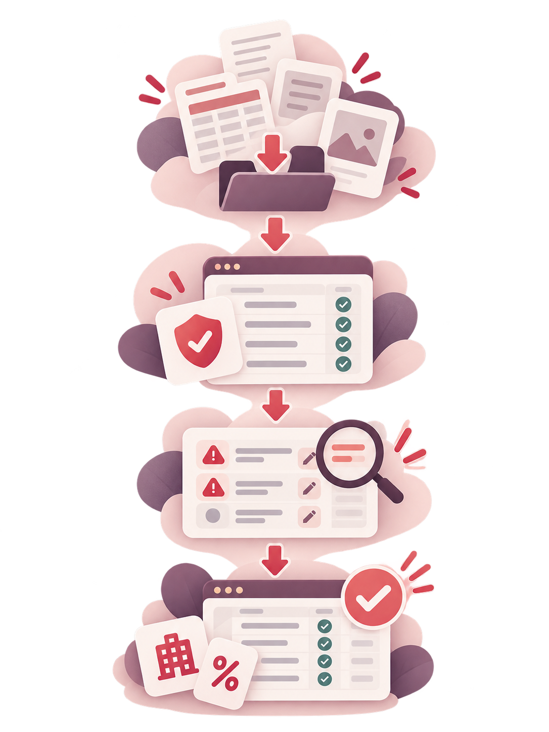
Translate the findings into a clearer experience for uploading data, validating it, surfacing issues, reviewing recommendations, and taking action.
How the workflow became easier to understand
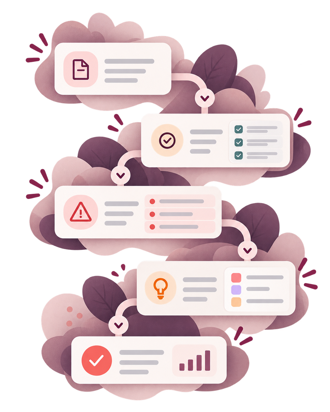
From upload to resolution
The redesigned experience made the stages of the work more visible. Users could move from bringing in rate-card data to validating it, identifying issues, reviewing what needed attention, and deciding how to proceed without having to reconstruct the process themselves.
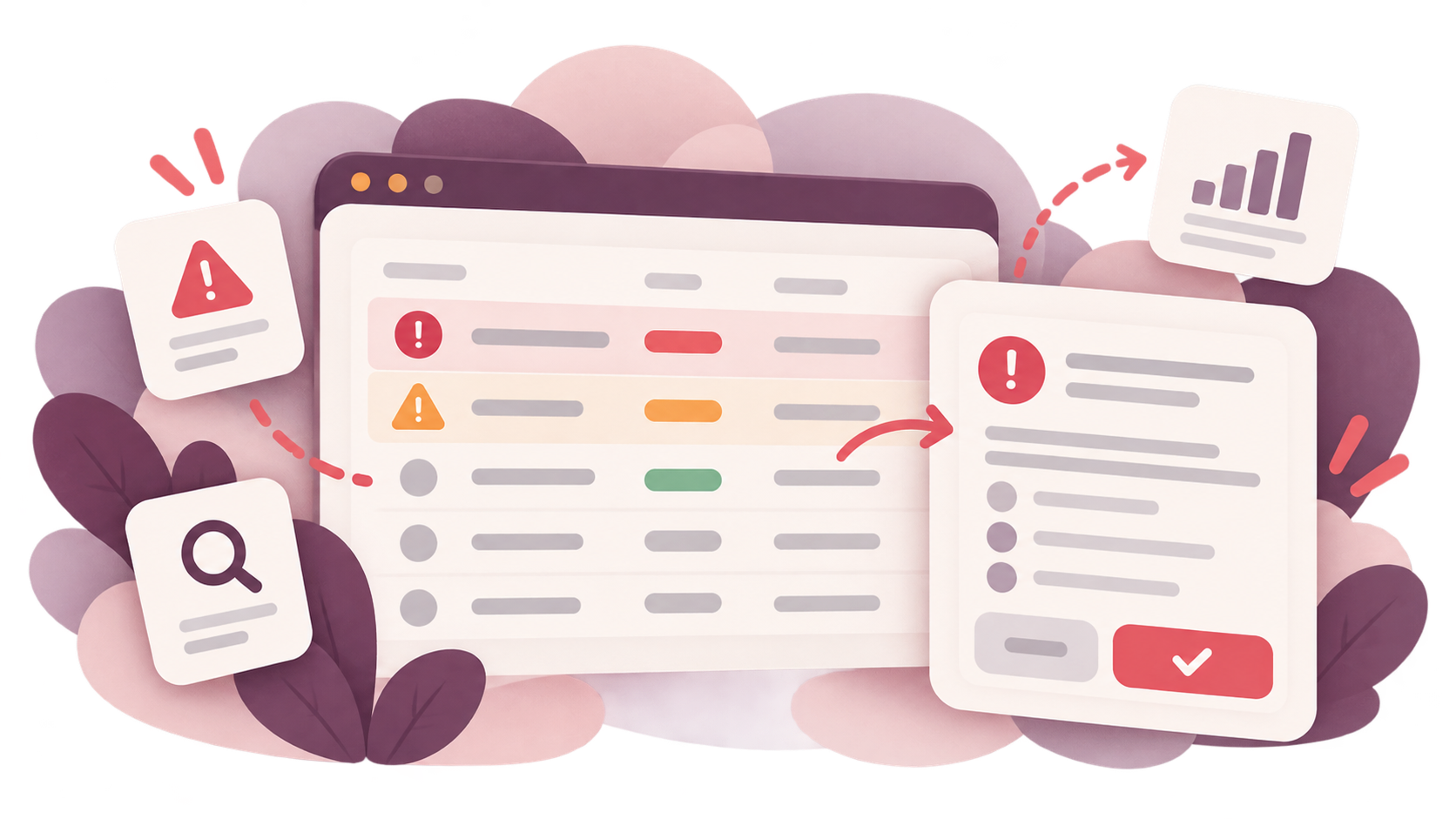
Making issues easier to act on
The work also focused on how validation results were presented. Instead of treating errors as isolated messages, the experience surfaced issues within the larger workflow so users could understand the problem, review the relevant information, and determine the appropriate next step.
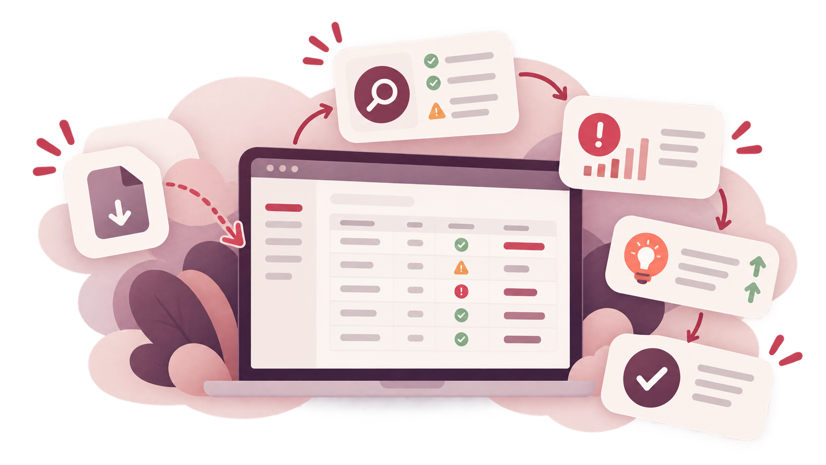
INSIDE THE ENGAGEMENT
What the work actually involved
This project went well beyond redesigning individual screens. It required understanding the people involved, mapping the full workflow, identifying where the existing experience broke down, and redesigning the structure of the product around the work users were actually trying to complete.
UX Leadership
Connected research, product needs, workflow strategy, and design direction.
Research & Discovery
Examined the existing product, user needs, current processes, and pain points.
User & Role Understanding
Looked at how different people interacted with the workflow and where their needs differed.
Customer Journey Mapping
Mapped the current-state experience across the complete rate-card process.
Design Sprint Facilitation
Created a focused space to align on the problem, explore solutions, and move from findings into design.
Workflow Design
Restructured the experience around the decisions and actions users needed to make.
Product Design
Translated the new workflow into detailed interfaces for validation, issue review, and related product tasks.
WHAT CHANGED
A clearer way to work through complex data.
The redesign created a more coherent relationship between the data, the issues being surfaced, and the decisions users needed to make.
Better visibility into what needed attention
Users could more easily see where problems existed and what required review.
A more understandable validation workflow
The process became easier to follow from the initial data through issue identification and resolution.
A more scalable product foundation
The redesigned workflow created a stronger structure for future product changes and additional use cases.
Enterprise UX is often about making complexity manageable.
This project was not about removing the complexity from rate-card management.
It was about understanding that complexity well enough to organize it into an experience people could actually work through. Research, journey mapping, collaborative design, and workflow redesign helped turn a fragmented process into a clearer system for understanding issues, making decisions, and moving the work forward.
Tell me what you're trying to improve.
You do not need to diagnose the UX problem first. Start with what you are seeing, what customers are telling you, or what you want the website or product to accomplish.