
Designing a financial experience people could build with.
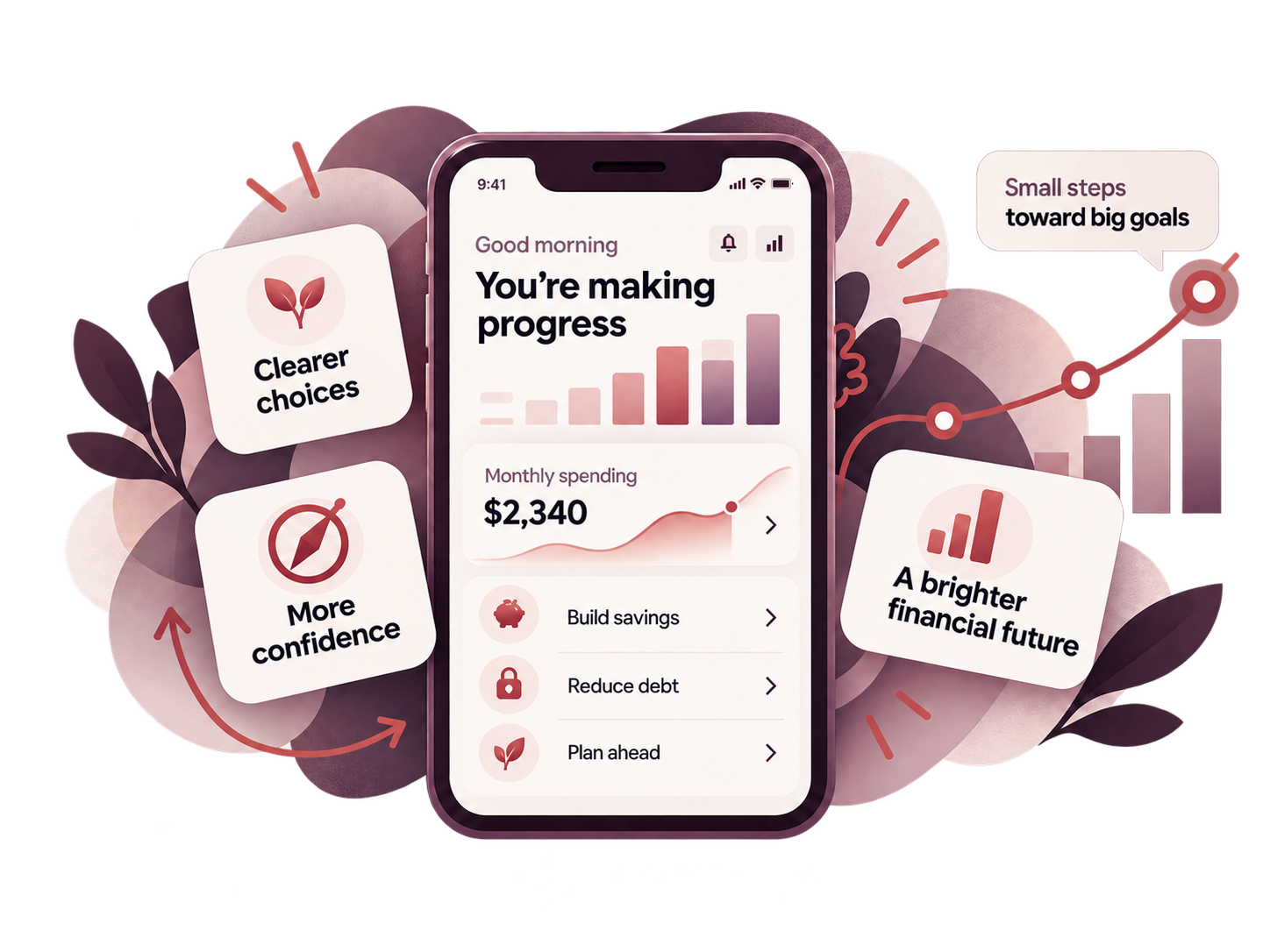
Financial tools often present people with answers they are expected to trust. This experience took a different approach. It helped users actively shape their own financial outlook by contributing information, exploring options, and seeing how their choices affected the picture over time.
INDUSTRY
Consumer financial wellness
My role
UX leadership, research, co-creation, product design
RESEARCH APPROACH
Qualitative, quantitative, and competitive research
DELIVERED
Responsive web, native iOS, and native Android experiences
Building a financial outlook with the user, not for them
The experience needed to do more than display financial information or return a single calculated answer. Users were contributing their own information, assumptions, and goals to build a picture of their financial future. The product had to make that process understandable enough that people could see how their inputs affected the outcome and feel confident adjusting things over time.The challenge was to create an experience that felt collaborative rather than opaque. Instead of asking people to trust a number produced behind the scenes, the product needed to help them understand how that number was being shaped.
What made this challenging
The answer needed to feel earned, not handed down
A financial outlook has more meaning when people understand where it came from. The experience needed to connect the result back to the information and choices the user had contributed.lish, and where existing financial tools were falling short.
People had to understand what to add and why it mattered
Users were being asked to provide information that affected the financial picture. The interface needed to make those inputs clear, manageable, and relevant rather than turning the experience into a long financial questionnaire.
The outlook had to stay flexible
A person’s finances, goals, and assumptions change. The product needed to support revisiting information, making adjustments, and seeing how those changes affected the broader picture.

WHY THIS WORK MATTERS
The value was in participation, not prediction.
A financial number can feel abstract when it appears without context.The experience became more meaningful when users could see how their own information and choices shaped the outcome. The product acted less like a black box and more like a tool for understanding.
Start with clarity, not more features.
The goal wasn’t to simplify the product until it felt empty. It was to make the experience easier to understand and easier to act on.
Understand what people needed to contribute
Identify the information, decisions, and context users needed to bring into the experience.
Show the relationship between choices and outcomes
Help users see how their inputs changed the financial picture instead of hiding the logic behind a final number.
Make inputs understandable
Structure the experience so people could add and adjust information without feeling overwhelmed.
Support iteration over time
Make it possible to revisit assumptions, update information, and continue refining the outlook as circumstances changed.

How the experience became easier to understand
Building the outlook together
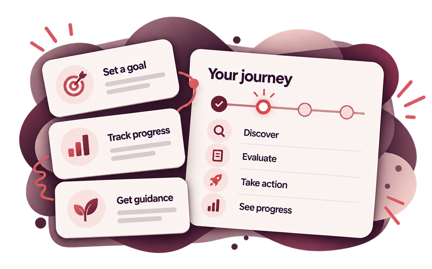
The experience guided users through adding goals, reviewing information, making choices, and seeing progress.
The important part was that the financial picture was not simply delivered to them. It was built through their own inputs and decisions.
Turning data into something personally meaningful
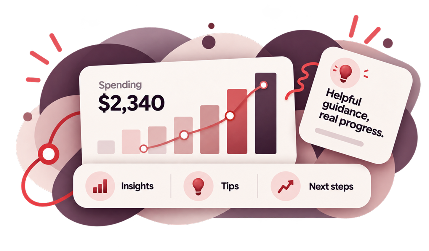
Financial data became more useful when users could connect it to their own goals, assumptions, and next steps.
The interface helped make those relationships visible so the outcome felt understandable rather than arbitrary.
INSIDE THE ENGAGEMENT
What the work actually involved
This project wasn’t only about interface design. It involved understanding how people processed financial information, where they became uncertain, and how content, structure, and interaction could work together to create a more supportive experience.
UX Strategy
Defined how the product could move from presenting financial information to helping users actively shape their own outlook.
Research Synthesis
Identified the information people needed, where uncertainty appeared, and what helped them feel more confident making decisions.
Information Architecture
Organized inputs, guidance, and outcomes into a structure that made the relationship between them easier to understand.
Product Thinking
Designed the experience as an ongoing system people could return to and refine, rather than a one-time calculation.
Interaction Design
Made it easier to enter information, adjust assumptions, understand cause and effect, and move toward a useful next step.

WHAT CHANGED
A more participatory financial experience
The biggest shift was from receiving an answer to building an outlook..
More meaningful results
Users could see how their own information contributed to the outcome, making the result easier to understand and trust.
Better visibility into cause and effect
Changes to inputs were connected to changes in the financial picture, helping users understand why the result moved..
A stronger sense of ownership
Because users were actively shaping the experience, the financial outlook felt more personal and relevant.
Good financial UX is not just about simplifying information.
Sometimes the better experience is one that helps people participate in creating the answer.
This project turned a financial outlook from something the product calculated for the user into something the user could actively build, understand, and refine over time.
Tell me what you're trying to improve.
You do not need to diagnose the UX problem first. Start with what you are seeing, what customers are telling you, or what you want the website or product to accomplish.