I spent two years leading UX for a B2B analytics platform where we built an AI-powered data storytelling feature. The technology was impressive, it could analyze hundreds of data points and generate executive summaries automatically. But watching user sessions, I could see the problem immediately. People would open the AI feature, see walls of generated text with no context, then go back to creating reports manually. The same 3 to 4 hour process they'd always used. The AI was doing exactly what it was designed to do. The problem was nobody designed the experience for actual humans trying to get work done. When we finally redesigned it, we focused on one thing: letting users clip insights they found interesting and organize them into stories. The AI would help with summaries and explanations, but users stayed in control of what mattered. That simple change, from "AI creates your story" to "AI helps you tell your story," completely transformed adoption. Usage went from occasional to becoming a core part of people's daily workflow. Now when I look back at the banking and travel platforms I worked on before AI became widespread, I can see exactly where intelligent features would have failed without proper UX design. At the banking company, we spent months solving the problem of helping customers understand their available money. If we'd had AI back then that could predict spending patterns, I guarantee it would have sat unused if it just displayed charts with no explanation. But imagine if we'd designed it to say something like "Your restaurant spending typically increases 23% in December, which might affect your available balance." Same prediction capability, but framed around decisions people actually needed to make. At the travel platform, we were always looking for ways to simplify the complex booking process. AI that could optimize entire booking flows would have been amazing, but knowing what I know now about user adoption, we would have started with simple suggestions like "Similar business travelers also booked ground transportation." Something users could quickly evaluate and act on, not a complete AI takeover of their booking decisions. The pattern is always the same. Technology that works perfectly but makes users feel stupid or powerless gets abandoned. Technology that makes users feel smarter and more capable becomes indispensable. Most companies approach AI backwards. They showcase how sophisticated their algorithms are instead of making users feel confident about using the insights. Your users don't care that your AI processes thousands of data points. They care about the one decision they need to make right now, and whether your AI actually helps them make it better. Here's what actually works: Design AI that amplifies human judgment instead of replacing it. Once people trust smaller, obviously helpful interactions, they become willing to try more sophisticated features. But you have to earn that trust first. The other thing that works is explaining reasoning in business terms, not technical terms. "Based on your Q3 performance data" is more useful than "Machine learning confidence: 91%." People want to understand why they should trust a recommendation, not how the algorithm works. I've led design teams at Fortune 500 companies and high-growth startups, and whether we're talking about AI features or traditional interfaces, the pattern is always the same. Features fail when they make users feel confused or powerless. They succeed when they make users feel smarter and more capable. Your AI probably isn't failing because the technology is wrong. It's failing because nobody designed it for how people actually work and make decisions. The companies that figure this out first are going to have a massive advantage. AI that people actually want to use, not just AI that technically works.

I have a confession: I learn more about user experience from pet-sitting cats than from most corporate UX workshops. Let me tell you about Hazel and Maggie, two absolutely adorable hairless kittens I was watching this month. Their owners had just invested in a fancy automated litter box. You know the type: self-cleaning, app notifications, LED status lights, the works. This thing probably cost more than my monthly car payment. The owners proudly showed me how it worked: sensors detect when cats leave, automatic cleaning cycles start, waste gets sealed away, and you get a phone notification about every bathroom visit. Sounds amazing, right? Day 1: Hazel and Maggie took one look at the automated litter box humming away in the corner, then walked directly to the plain backup litter box sitting next to it. They used that one all day. Day 2: I watched Maggie approach the fancy box, sniff it suspiciously, then turn around and use the regular one again. Meanwhile, the automated box kept sending me notifications about "maintenance needed" even though no cat had used it. Day 3: The automated box went offline. Just... stopped working. Red light. No app connection. I spent 20 minutes trying to restart it while Hazel and Maggie continued happily using their boring, non-smart litter box. Here's the kicker: I have the same thing at home. My cats have access to both an automated litter box (that goes offline at least twice a week) and a regular one. Guess which one they prefer? The regular one. Every. Single. Time. Here's what Hazel, Maggie, and my own cats taught me about user onboarding: Reliability beats features every time. That automated box had 15 different functions, but if it doesn't work when you need it, none of those features matter. Same with your app or platform - it can have every bell and whistle, but if it crashes or loads slowly, users will look elsewhere. Users will always choose the path of least resistance. The cats didn't need an app notification to know they'd used the bathroom. They just wanted to do their business and move on. Your users want to solve their problem quickly, not navigate your complex interface. "Smart" technology that creates more problems isn't actually smart. I became tech support for a litter box. Your users don't want to become tech support for your SaaS platform. Backup systems reveal what users actually value. When given the choice, cats picked simple and reliable over fancy and complicated. When your users have options, what do they choose? How this applies to your digital product: Whether you're building a SaaS platform, mobile app, or web application, it's like that automated litter box. If users can't immediately understand how to accomplish their goals, they're going to find your competitor's "regular litter box" solution, the one that just works without drama. The best user experience feels invisible. My cats never have to think about using the regular litter box. Your users shouldn't have to think about using your software. Sometimes the smartest solution is the one that never breaks. Hazel and Maggie just wanted a place to go without notifications, maintenance alerts, or Wi-Fi requirements. Your users just want to solve their problem without jumping through hoops. What's next: Every week, I'm going to share stories like this, real moments from my life as a mom, entrepreneur, and professional cat-sitter that taught me something useful about how people (and cats) interact with digital products. Some weeks it might be what my twin daughters taught me about user preferences. Other weeks it could be lessons from my candle business, or observations from soccer tournament app disasters. I've spent 25+ years designing digital products for Fortune 500 companies, including banking platforms, SaaS applications, and travel platforms used by millions of people. But honestly? The best insights come from watching real behavior in real life, not corporate conference rooms.

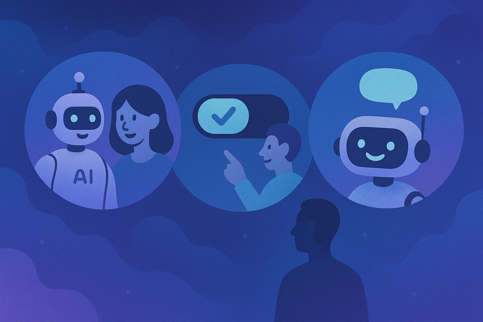
Let's be honest: implementing AI is hard. Really hard. Over the past few years, I've been fascinated by the stories of companies integrating AI into their products and internal workflows. The excitement is always palpable at the beginning, the possibilities seem endless, the potential transformative. But then reality sets in. Even with fantastic technical teams and significant investment, organizations struggle to translate AI capabilities into solutions that users actually adopt and value. It's not surprising that research shows over 80% of AI implementations fail to deliver on their promises. What separates the successful 20% from the rest? After studying numerous AI implementation cases, I've noticed it's rarely the sophistication of the technology. Instead, it's the thoughtfulness of the user experience design surrounding that technology. Here are five critical strategies that can dramatically increase your odds of successful AI implementation. 1. Start with User Needs, Not AI Capabilities One of the most common patterns in failed AI projects is companies becoming entranced by AI's capabilities and looking for places to apply it, rather than starting with genuine user needs and determining whether AI is actually the right solution. I recently read about a SaaS company that was determined to implement a sophisticated AI-powered recommendation engine because their main competitor had just launched one. When they finally stopped to ask what problem they were trying to solve for users, the team struggled to articulate a clear answer. The Better Approach: Begin with a deep understanding of your users' actual pain points and workflows. Map their journey, identify moments of friction, and look for opportunities where AI could remove obstacles rather than create new ones. For companies facing this challenge, taking a step back to conduct focused user research often reveals that what users actually need isn't what was initially assumed. For instance, users might want faster access to relevant information when making complex decisions rather than automated recommendations—leading to an intelligent search system that surfaces contextual information at key decision points. 2. Design for Appropriate Trust, Not Maximum Automation Another common pitfall is companies designing for maximum automation rather than appropriate trust. They focus on what the AI can do rather than what it should do given the context and stakes of the decision. In healthcare technology, for instance, AI systems designed to automatically prioritize patient cases without clinician input often create significant resistance from medical staff who feel their expertise is being sidelined, even when the technology works as intended. The Better Approach: Map decisions along two axes: consequence and complexity. For high-consequence or highly complex decisions, design AI to augment human judgment rather than replace it. For lower-stakes, more routine decisions, greater automation might be appropriate. The most successful healthcare AI implementations present case prioritization as suggestions with clear reasoning, allowing clinicians to quickly review and adjust if needed. This collaborative approach addresses concerns about professional judgment while still delivering the efficiency benefits of AI. 3. Create Transparent Interfaces That Build Understanding Organizations implementing AI-powered systems often struggle with the "black box" problem. Users don't understand how decisions are being made, leading to mistrust and resistance. In financial services, for example, AI-powered fraud detection systems that simply flag transactions as "suspicious" based on AI analysis, with no explanation, often generate frustration from both customers and service representatives. The Better Approach: Design interfaces that make AI decision-making transparent in user-friendly ways. This doesn't mean exposing complex algorithms, but rather translating AI reasoning into understandable terms that build user confidence. Effective fraud detection interfaces create simple visualizations showing which factors contributed to the suspicion score, using plain language explanations like "unusual location" or "pattern differs from typical spending." This transparency helps reduce complaints and helps service representatives resolve cases more quickly. 4. Build Learning Loops Into Every AI Experience When users provide feedback to AI systems but don't see visible improvement, they quickly lose faith in the technology. This is a particularly common issue in content recommendation and analytics platforms. For instance, when users repeatedly dismiss irrelevant recommendations or insights but the system continues offering similar ones, it creates the impression that the AI isn't actually "learning" or responding to feedback. The Better Approach: Design explicit feedback mechanisms into AI experiences and make learning visible to users. When people see that their input improves the system, they become invested in its success. Successful implementations include simple feedback systems where users can indicate whether insights are useful, along with a quick reason why or why not. Adding a "Getting smarter" notification that appears when the system incorporates feedback to improve personalization can dramatically boost long-term engagement with AI features. 5. Implement AI Gradually, With Clear Metrics for Success Organizations eager to embrace AI often attempt to transform everything at once, new recommendation engines, chatbots, dynamic pricing, and personalized experiences all simultaneously. This approach typically overwhelms both internal teams and end users. The Better Approach: Implement AI in phases, starting with focused use cases that deliver clear value. Establish specific metrics for success beyond technical performance, including user adoption, satisfaction, and business impact. Companies that take a measured approach, starting with focused implementations like product recommendations in specific categories, create room for careful measurement and refinement before expanding to other areas. Each new AI capability should be evaluated against specific adoption and business metrics before moving to the next phase. The Human Element Is Your Competitive Advantage The most successful AI implementations share a common trait: they treat the human experience as a primary design consideration, not an afterthought. As AI capabilities become more widely available, the technical differentiators between competing solutions will diminish. The real competitive advantage will lie in how thoughtfully organizations integrate these capabilities into human workflows and experiences. This is precisely why UX leadership is becoming increasingly critical in AI implementation. It's not enough to have data scientists and engineers creating powerful algorithms. You need experience designers who understand human psychology, behavior, and needs to translate those technical capabilities into solutions people actually want to use. Putting It All Together: A Framework for Success When approaching AI implementation, consider using this simple framework that integrates the five strategies: Identify: Map user journeys to find high-value opportunity areas where AI could solve real problems Evaluate: Assess each opportunity based on potential value, technical feasibility, and appropriate level of automation Design: Create transparent interfaces with clear feedback mechanisms, focusing on building appropriate trust Implement: Roll out capabilities in focused phases with clear success metrics Learn: Collect user feedback, measure against success metrics, and continuously improve This user-centered approach to AI implementation consistently delivers higher adoption rates, greater user satisfaction, and ultimately, better return on AI investment. The Path Forward As AI capabilities continue to evolve, the organizations that succeed won't simply be those with the most advanced technology, they'll be the ones that create thoughtful, human-centered experiences that build trust and deliver genuine value. If you're embarking on an AI implementation journey, I encourage you to put user experience at the center of your strategy from day one. It might seem like it slows you down initially, but it dramatically increases your odds of being in the successful 20% rather than the failing 80%. And that's a much better return on your AI investment. Ready to discuss how user-centered design can help your organization successfully implement AI? Let's chat.
We've all been there. You're using a new AI-powered feature, and suddenly it does something unexpected. Maybe it's suggesting products you'd never buy, displaying information that seems completely off-base, or making a recommendation that leaves you wondering, "How on earth did it come up with that?" And just like that, trust is broken. As someone who's spent years in UX design and who follows developments in AI implementation closely, I've become fascinated by one critical question: Why do users trust some AI systems but reject others? The Trust Gap in AI Adoption Here's a sobering reality: over 80% of AI implementations fail to deliver their expected value. Not because the technology doesn't work, but because people don't use it. And why don't they use it? It usually comes down to trust. Trust isn't just a nice-to-have in AI user experience, it's the entire foundation. Without it, even the most sophisticated AI investment becomes an expensive experiment that never delivers. The Three Pillars of Trustworthy AI Experience Based on extensive research and observation of successful AI implementations, I've identified a framework for building AI experiences that users actually trust and embrace. It's built on three fundamental pillars: 1. Transparency Without Overwhelming Users need to understand what the AI is doing without drowning in technical details. This means: Explaining recommendations in human terms Making clear when AI is being used versus traditional functionality Providing appropriate confidence indicators Offering access to more information for those who want it Consider financial services, where AI-based investment recommendations often go ignored by users. A simple "Why am I seeing this?" feature that explains each recommendation in plain English, connecting it to specific financial goals, can dramatically increase adoption. 2. Control at Critical Moments People need to feel they're working with AI, not being controlled by it. This means designing for: User confirmation at key decision points Easy ways to guide, adjust, or override AI suggestions Clear feedback mechanisms Progressive levels of automation as trust builds In healthcare applications, for example, successful AI symptom assessment tools allow users to adjust the importance of each symptom they report, ensuring they feel heard and respected. This control mechanism can increase both user satisfaction and diagnostic accuracy. 3. Continuous Improvement Through Feedback Trust grows when users see the system getting better based on their input. This means creating: Simple feedback loops within the user journey Clear signals when feedback has been incorporated Personalization that visibly improves over time Acknowledgment when the AI gets something wrong Marketing analytics platforms that implement one-click feedback systems for AI-generated insights can create a virtuous cycle where the system visibly improves for each user, driving deeper engagement. Practical Implementation: Start Small, Build Trust If you're incorporating AI into your product experience, you might be tempted to go big with flashy, highly automated features. My advice after studying dozens of successful AI adoptions? Start small. Begin with low-risk, high-value use cases where AI can clearly enhance the user experience without taking over completely. For example: Smart defaults that save time but can be easily changed Subtle suggestions that guide without dictating Background enhancements that make existing features work better In retail, for instance, companies often find more success starting with AI-powered search that simply reorders results based on browsing history rather than implementing fully automated personalization across the entire shopping experience. This creates immediate value while allowing users to discover the benefits of personalization in a comfortable, low-stakes context. The Human Element Remains Essential The most successful AI experiences maintain a decidedly human element. They acknowledge limitations, handle errors gracefully, and maintain the brand's personality and voice. When designing conversational AI for customer service, the most effective systems recognize when a customer is getting frustrated and smoothly offer to connect them with a human agent. This "escape hatch" often increases overall satisfaction with the AI system because users never feel trapped. The Future of AI User Experience As AI capabilities continue to evolve at breathtaking speed, the human side of the equation becomes even more critical. The organizations that succeed won't simply be those with the most advanced algorithms, they'll be the ones that create thoughtful, human-centered experiences that build trust and deliver genuine value. The most powerful AI implementations don't feel like interacting with technology at all, they feel like having a particularly insightful colleague who understands exactly what you need and helps you accomplish it with minimal friction. That's the gold standard for AI UX: technology that feels less like a tool and more like a trusted partner. Building Trust from Day One If you're embarking on an AI implementation journey, make user trust a central consideration from the very beginning. Ask questions like: Where in the user journey would AI add the most value with the least disruption? What level of explanation would users need to feel comfortable with AI-driven decisions? How can we give users meaningful control without overwhelming them with options? What feedback mechanisms will help the system visibly improve over time? These considerations might seem secondary to the technical implementation, but they're actually the primary determinants of whether your AI investment will succeed or join the 80% that fail to deliver value. Ready to Design AI Experiences Users Actually Trust? If you're navigating the complex landscape of AI implementation and want to ensure your investment translates into user adoption and business value, I'd love to chat. I'm passionate about helping organizations create AI experiences their users actually trust and embrace.

Learn how to build and implement effective design systems that scale. Discover practical strategies for improving development efficiency, ensuring consistency, and driving adoption. Expert guide by Michelle Morley based on enterprise implementation experience.

Explore how fractional UX leadership can transform your product development. Learn when and how to leverage experienced design leadership without the full-time commitment. Expert insights from Michelle Morley on implementing successful UX strategies.

Discover why UX is crucial for business success beyond aesthetics. Learn how strategic UX investment drives down costs, increases customer loyalty, and creates competitive advantage. Written by Michelle Morley, drawing from 15+ years of enterprise UX leadership experience.